
For the past thee posts, I’ve been telling you about how I began weaving with newspaper, why I began using newspaper and how my use of newspaper has evolved over the past 40 years. I this blog, I want to focus on one particular woven piece and talk about how it came together.
I chose this piece for several reasons. First, it seems to garner most comments from the viewing public. Second, it won the Commissioners’ Award in the 2010 Palm Springs Juried Art Competition. And third, it visually shows the possibilities when using newspaper.
I save newspaper. My main source of newspaper is the LA Times. Perhaps the LA Times being our local daily paper had much to do with it and for that, I’m thankful. This is Tinsel Town; home of the movie studios; the city where Stars are made. The LA Times is as glitzy as the city. We have a very colorful newspaper. Thank God!
When I have an “Ah ha!” moment for a weaving or a series, I begin sorting through my stacks of newspaper looking for my color palette. Blue ink must have been on sale several years ago. There seemed to be a lot of movie ads with blue: Polar Express, Babe, that cartoon about Penguins and some science fiction movies with a lot of blue.
I sorted through the paper looking for blue movie ads (not to be confused with blue movies). I need about 20 to 25 sheets of newspaper to produce a weaving approximately 30 by 45 inches. Lots of blue! I had 40 or 50. I could be very selective. For this piece, I wanted to have as little print on the finished weaving as possible. A letter here or there would be OK, but not entire words. I didn’t’ want the print to be prevalent. I prepped my paper and cut it into half inch strip to minimize the print. Strips this narrow presented a whole new set of problems, but more about that later.
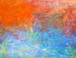
The chosen design was simple. It was to be a circle with a disk inside of it. I sorted through my paper again looking for yellow and set them aside. For the center disk, I selected orange. Remember those Cingular ads; all that orange? I had a lot of those ads. So I used them, too. The yellow & orange provided a good contrast to the blue.
The majority of the weaving was to be blue with a yellow circle and an orange disk in the center of that. One of the “issues” with my weaving methodology is that I use a basked weave where the end result looks like squares. It’s a square grid. That’s an awfully difficult way to produce a circle and I wanted two of those puppies. That’s the second reason I cut my paper into half inch strips: smaller squares are needed for the smaller weaving to produce the circle. I didn’t want a “perfect” circle anyway, so it would be OK.
I mentioned in a prior post that newspaper has a grain: It’s stronger in one direction than the other. However, when it is cut in half inch strips, it’s pretty fragile even when cut with the grain. It would snap in half easily. Damn! I would have to be very careful! I sketched out my design, transferred it to my weaving surface and began.
I rejected quite a few strips of blue, editing for color over print. AND it took me a bit of time to learn how to manipulate the paper so as not to rip it while working. As I became proficient at it, the weaving went faster. I eventually reached that pivotal point where I needed to begin the yellow circle. What a pain in the butt that turned out to be! Think of one of those goofy palm hats with those unwoven bits sticking out along the edge and you have an idea of what I was dealing with. I was trying to “see” a circle in the middle of all those strips of as yet unwoven paper sticking out all over the place! I finally got it under control when I realized I needed to add that orange disk in the middle of the yellow one.
When I finally got the two circles completed, I discovered I had shifted them towards the top of the weaving too much. I had to extend the weaving by nearly a foot to realign the image properly. Fortunately, I had a lot of blue newspaper. I was going to name it “Cingular Sensation” but worried about copyright suits. So I named the weaving “Cardenas Sun” because the yellow came from one source: ads for Cardenas Market. My friend and graphic artist, Davi, calls the weaving the “Egg Yolk”. It’s probably a better name.
I learned a lot while weaving this image. I learned that I’m not going to be weaving very many circles, nor am I going to be using half inch strips of newspaper! I did weave another piece using the same design idea with the printed word as the design element rather than color. I used the Stock Market numbers, the daily comics and the editorial page. The design was very subtle; not as eye catching as “Cardenas Sun.”
I have people ask me questions like:
“Did you paint each one of those tiny squares one by one?”
“If you wanted blue, why didn’t you just paint it blue?”
“Did you cut out each one of those tiny squares?”
Cardenas Sun is available for purchase. You can see all of my artwork available for purchase on my website at www.JerryLHanson.com . If you want more information about “Cardenas Sun” or any of my artwork or to make a purchase, you can contact me by replying to this blog, e-mail me at JerryL@JerryLHanson.com or telephone my studio at 760.992.3157. And, as always, I thank you for listening!
Jerry L. Hanson


i like this image but i really love sailor's delight. i love the color combination!! it sparkles and awakens the senses.
ReplyDelete