Friday, March 26, 2010

Painting a Series: Cohesion & Contrast


As an artist, my bouts of creativity come in waves. Although I work almost every day, I have periods where I can do nothing other than paint. I will be in my studio from early morning until late at night. It drives my husband crazy. And it drives me crazy too.

I get an idea in my head which may evolve into a series of artwork, whether color field paintings or woven pieces. I have to follow that idea through to its conclusion. My current series came to be in just this manner.

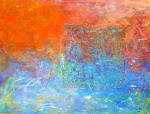
I had been painting color field canvases for a number of years in which I would attach a field of woven newspaper and either continue painting on that canvas, or not. I wondered what my canvases would “look” like if I began a number of them in the exact same manner: affixing the woven field to the canvas before beginning. What would that subtle change do?

I purchased five large canvases and five smaller canvases. On the larger canvases, I affixed a 16 inch by 16 inch sharp edged square of woven newspaper. On the other five, I affixed a rectangle of ragged sided weaving. I placed them in the same place on each set of five. They sat there in my studio driving me crazy.

Great idea. Now what? I had no clue how to proceed. Procrastinating, I completed two commissions for clients in Los Angeles. I completed three other weavings inspired by those commissions. I made a shower screen out of tin can lids. Still, those canvases sat there, each with a rectangle or square of woven newspaper permanently fixed to its pristine white surface. Why was this so hard?

I realized that the woven field had to be the beginning point for the painting. Before, I took a puzzle or concept to the new, pure white canvas and much later chose the woven field for the painting. With this series, I had to let the woven field be the starting point for the painting. I studied the woven field and chose the palette based on the weaving. Not the other way around.

The first canvas was challenging as I developed the relationship between the woven field and color field. I began to enjoy that dialogue. The second canvas was easier as the woven field receded into the canvas with each subsequent layer of paint. The weaving was no longer the focal point of the canvas as in earlier paintings. My moods and musings played a larger part in the evolution of this series. The weather, light on lemon trees, wet lawns in morning light or dreary rainy days influenced these paintings. The woven field is barely discernable in some of the paintings.

Thirteen paintings later (yes, I purchased additional canvases) I’m enjoying the dialogue between the “fixed” field and the emerging painting. I don’t know where this series will end as I have not yet exhausted the possibilities, although other ideas for a series are encroaching as I paint. At some point they can no longer be ignored.

What I notice about this series is that each painting stands on its own yet works well with one another. Hung together in a grouping, they present a cohesive presence. Each is different and unique yet there is a relationship between them.

These paintings are available for purchase either singly as a statement for the home or as a series to provide a cohesive presence in a commercial setting. You may contact me via e-mail at JerryL@JerryLHanson.com or through my website at www.JerryLHanson.com . You can also telephone my studio at 760.992.3157.

Thank you for listening and visiting my blog.
Jerry

Sunday, March 21, 2010

"Ice" Featured Painting of the Week


Ice
Acrylic and newspaper on Canvas
30” X 40” 2009.12.16

Have I mentioned how I love living in the sun and heat of Palm Springs? Have I mentioned how I loathe cold weather? I’m a broken record, huh?

I grew up in Indiana where the summers were hot and humid, the winters cold and humid. I left Indiana when I went off to serve in the USAF during the Viet Nam “conflict.” I spent my active duty in Southeast Asia and Tucson, AZ, mostly in Southeast Asia. After four years of not seeing snow, I knew I would never return to live in it again. I made a bee line to Tucson and the U of A after my discharge and I’ve not lived in snow since.

I believe I was a lizard in a prior life. To live my life on a rock in the sun is my idea of nirvana. I came back as a resident of Palm Springs. That’s close enough for me.

Winters in Palm Spring are absolutely balmy as compared to, oh, Maine. Or Chicago. The temps drop into the frigged 60’s and I search for my mukluks. My paint splattered mukluks. . As I write this, it is a cloudy, overcast day. The thermometer continues to hover below 60 at mid day. So, now that I’ve set the stage for this painting and my state of mind, let’s talk about the featured painting for the week. Ice.

I selected this particular canvas to paint for the colorful woven field; the riot of color. I love Kohl’s Department Store for the colorful ads they have in the daily paper. It’s a great resource for my work.
There are some particularly interesting shades of blue in the weaving which drew me to a blue palette to begin.
I originally began the canvas thinking of a dark, moonless night with a blue-black sky. Damn! It was cold in my studio! I often brush water over the surface of a wet canvas to eliminate brush strokes and just because I like the randomness of the result. The result of the water-wash was intriguing. I wanted to keep it visible. I added three layers of medium with very little blue pigment of varying hue. I set the canvas aside and headed off to my warm bed.

The next morning, I visited the canvas to see how a night’s sleep affected my perception of it. Wow! I liked it! But it felt so unfinished. But I didn’t’ want to touch it. What to do? I noticed the edges of the canvas were untouched and stark white. Hate that! I painted the edges dark blue. And that was all it needed.

The painting makes me shiver and long for my mukluks. Ice. This painting is available for purchase. If you are interested or want to know more about this painting, please respond to this blog, E-mail me at JerryL@JerryLHanson.com or contact me at my studio: 760-992-3157. You can see more of my artwork for sale at www.JerryLHanson.com

Thank you!
Jerryl

Saturday, March 13, 2010

Featured Painting of the Week: Citrus Morning


Citrus Morning
Acrylic paint & newspaper on canvas
24” X 36“ 2010.02.14

My favorite time of the day is the early morning. I’m an early riser, waking up about 5:30AM every morning. I’m up and out of bed testing the weather while fetching the morning papers (my raw material) from the driveway. Then I feed our two cats, make the first pot of tea of the day and settle into my studio.

I’m in my studio when the sun peeps over the mountains to the East lighting up the garden and my studio. I love the Palm Springs sunrise, crisp, clear, clean; always a surprise. I watch the sun creep across the garden illuminating the plants one by one. Every morning, the light is different; colors changing with the light.

We had, for Palm Springs, a wet winter. One morning as I watched the sun light up the garden, I noticed the lemon tree glowing yellow, green and blue. Blue! Where did that blue come from? I grabbed my camera to capture it. I sat watching that tree until the sun’s brightness bleached it back to “normality”

I uploaded my photos into my computer anticipating the images and colors captured that morning. The camera gave back my lemon tree with no luminescent yellows & greens. No blue. Just my puny lemon tree looking as it normally does. Drat.
If that damned camera can’t do it right, perhaps I could. With those colors in my head, I began painting. I did a much better job of it than @Nikon! I used iridescent white and silver in my palette to add luminescence to approximate the shifting quality of light. I layered yellows & blues to pull greens from the two. I tried a bit of red but the resultant orange wasn’t right so I layered more iridescent yellow and white to pull it back.

My paintings are multiple layers of paint. The initial layers glow through to the surface of the finish piece. I eventually pulled the colors together to approximate the colors I saw glowing in the lemon tree.

When I photographed the finished canvas, I discovered this painting was as difficult to photograph as my lemon tree on that magical morning. The greens were elusive; the blues predominate. The painting’s colors shift in the light. The blue and green struggle for dominance, much as it did on that early morning in February.

This is how Citrus Morning came to be. If you are interested in purchasing or knowing more about this painting, please respond to this blog, E-mail me at JerryL@JerryLHanosn.com or contact me at my studio: 760-992-3157. You can see more of my artwork for sale at www.JerryLHanson.com

Thank you!
Jerryl

Wednesday, March 10, 2010

JerryLStudio – A Retrospective of the Week March 10th 2010


Here are some of my own Tweets that were taken down the Twitter stream by some of my followers. I hope they resonate with you as well :-)

One canvas refuses to talk to me. Of course that’s the one I obsess about.

I do love a puzzle. I began the painting on one of my paint dates. I was enjoying the spontaneity of the moment. The balance was off; the color, difficult. I looked at this canvas every day (often!) wondering where to take it next. I added yellows and blues to liven it. Still out of balance with no woven newspaper field. I sorted through my supplies and found a suitable weaving and cut it to fit. After an hour of moving the weaving on the canvas, I rotated the canvas and achieved BALANCE! Now! What next? It is still wanting more. I hope to show you the completed canvas soon.

My high school friend’s husband died today. What color is grief? How do I paint sadness?

She was one of my closest friends in high school 45 years ago. I dreamed we’d marry one day. We didn’t’. She met and married an incredible guy who appreciated and loved her absolutely. He was wonderful. I’ve not seen them for over 10 years – they live across the country from me. I learned he’d died during heart surgery. I cannot imagine what she must be going through. The grief & sadness.

My stash of tin can lids is growing! And friends wonder why I love tomato juice so.

The first time I opened a can using my spiffy new smooth lid can opener, I beheld that disk of tin and said, “This is so cool! What can I do with this puppy?” I saved every lid from every can for four years. I purchase tomato juice in cans for the can lids (and I love tomato juice). I made a shower screen (not curtain) out of the lids using 76 tomato can lids and 122 soup can lids. It’s incredible! Now I want another screen! Drink more juice!

Ever caught yourself studying reflections in glass wishing you could paint those colors?

People think I’m having some sort of petit mal seizure. My eye catches light reflected in a glass or coffee, or the salad dressing at the end of a meal. The colors can be spectacular! Am I the only one who notices? One of my favorite RTs is from @MarkS_Art who, in one word, validated my observation. He made my day! He said: Yes!

It’s clouding over. I predict a dark & gloomy paint palette. #savemefromrain

Anyone who reads my tweets, reads my blogs, knows me knows I love the sun, love the heat, loathe cold and wet and rain. My dark and gloomy moods are in direct proportion to cloud cover.


Here are some Tweets I found edifying (or just plain fun)

@OrlandoDesigner I am volunteering to help give our local animal shelter a badly needed facelift- recruiting friends to help, maybe a fundraiser. Fun! http://twitter.com/OrlandoDesigner/status/9921932480

I would have absolutely no pets if it weren’t for the earth angels at animal shelters. My dog (1) and cat (7 & counting) have come from shelters. They bring me joy and keep me sane. Our African Sulcata tortoise (Torguga) was rescued in Tucson and eventually found his way into my garden. I went with @TheDeeView to the local animal shelter looking for a new dog. I offered a piece of my artwork to @OrlandoDesigner’s fundraising efforts. I urge other artists to donate to good causes such as this.

@madfashionista Oh dear lord, I know the actress in the toilet-paper commercial. I'll never be able to look her in the face again.

Dharling, you make me smile. You had me ROFL Oscar night! Thanks for the laugh (as you always do!)

@ShykiaBell The secret of innovation is to see what all see but think what none think. Robin Sharma (via mark_tetzner)

It is like my love affair with newspaper. Other’s read it, I re-think it into art! Thanks for the reminder!

@SwarezArt I uploaded a YouTube video -- Swarez - One year in Paintings, Abstract and Modern http://youtu.be/fbgOtguqog4?a

An amazing video of his art over the past year. You have inspired me! How can a painter live without a piece like this! TY


A shout out to some my newest followers (I know, someone is actually reading what I wrote #suchascarythought #cantthinkofthatorwillstopwriting)

@adoptionart @MI2design @LarryBlanken @xaxii @JenKuhnPR

And another to some of those that #MentionMonday RTed my blog. A great thanks to you all!

@McKinnonCC, @DoubleKCreative, @spudrph, @mduffywriter

And lastly a few blogs I found through #MentionMonday.

@MonikaDickson Also trying out this #MentionMonday thing for my art blog, and I love to get your comments. http://monikad.ca/page8.php?post=2

Always great to support other artists. Loving the colors in those paintings. Glad to find a fellow artisan blogger!

@elijzbar #MentionMonday if you like hilarity, sarcasm and over all awesomeness, check out my blog! http://bit.ly/a5uMWQ,

Besides living up to her hype, she’s captured some great images!

@craftycmc #MentionMonday "That's a Nice Rack!" No, not what you think. Hmmm, with this crowd...? http://is.gd/8Wyl1 RT pls @craftycmc

Funny, funny stuff, plus she is the founder of #MentionMonday, so all you bloggers might want to DM her to join in to promote your blogs (it really helped ‘launch’ my blog, “Sailor’s Delight”)


I hope you found this blog as entertaining to read as it was for me to write #didntreallybuthadtosaythat. Feel free to leave comments below or to inquire regarding “Sailor’s Delight” (or any other painting for that matter) do not hesitate to contact me at @jerrylstudio or jerryl@jerrylhanson.com

Friday, March 5, 2010

"Sailor's Delight" Featured Painting of the Week

Welcome to JerryLStudio and my first blog. Ever.

I’ve worked with computers since 1970 and it still took a lot to convince me to take this leap into cyber-space with my art.

I'm an artist, I still don’t do binary code.

Yet, I came to realize that this world of tweets and blogs may be a place where my art can flourish.

People from around the world can view and hopefully (my fingers are crossed at this point) appreciate my work.

Here I hope to expand on my work, giving you a glimpse into my inspiration, my process and ultimately my feelings regarding the final piece.

So without further sound bites, here is my first Featured Painting of the Week :

"Sailor's Delight"
(
2010.01.20, Acrylic paint and newspaper on canvas, 30” X 40”)

Many of my color field paintings are a reflection of my mood at the time I paint it. This canvas is a good example of that. In my current series, of which this canvas is a part, I began with a field of woven newspaper fixed to a blank canvas. This is/was my starting point.

January was a gloomy month with days of rain and little sunshine. The day was dark and brooding; that was my mood when I approached this canvas. There was no color in the newsprint weaving to suggest a paint palette. As I began, the canvas became dark blue with multiple layers of increasingly dark paint with lighter blues underneath the dark.

As the day lightened and the forecast brightened, so did my canvas. I added white and yellow to the brooding blues. I wanted transitions from blue to red. As I painted, I was aware of the storm front passing through and looked forward to clear skies and warmer days. My mood lightened as did my canvas.

I pause often to look at my developing painting and let it “lead” me toward its conclusion. An old rhyme from years ago was running through my head. “Red skies in morning, sailors take warnings. Red skies at night, sailors delight.” I rotated the canvas seeing which way was up. Ah! Sailor’s Delight!

If you are interested in purchasing this piece, reviewing my other work or wish to discuss a commissioned piece, leave a comment below or email: jerryl@jerrylhanson.com

Thank you for listening to my rambles and see you next week.